

Click here to view as PDF. “The Fed’s dual mandate is that of arsonist and fire brigade.” -JIM GRANT “In their efforts to promote jobs and growth, central banks are trading the possibility of immediate economic gains for a growing risk of financial instability later.” -MOHAMED EL-ERIAN, former Pimco CEO “I do not think it works. I also think it is enormously dangerous.” -WILLIAM WHITE (former Chief Economist for the Bank of International Settlements, and one of the world’s few senior bank officials to anticipate the global financial crisis), referring to ultra-easy monetary policies.
INTRODUCTION
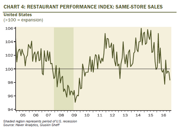
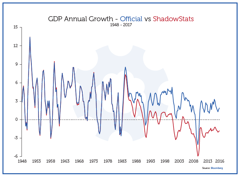
By David Hay / CIO, Evergreen Gavekal (Reader’s Note: Introductions to Guest EVAs are meant to serve as summaries for those who don’t have time to read the full issue.) The Great Inflation Debate, Take Two. In our February 17th Chartbook EVA, we entered into the always hotly contentious realm of attempting to determine the true level of inflation and, closely related to that, its trend. It goes without saying—but I will anyway—that there are few areas where the words “Believe those who are seeking the truth; doubt those who say they have found it” are more applicable. In this week’s Guest EVA, we examine two essays on this controversial subject. The first is from one of my closest friends in the investment business, Grant Williams. The other is from a new friend, Anantha Nageswaran. As you will soon read, they take very different views of the CPI (Consumer Price Index) in the US, past and present. In the first section, based on a significantly condensed version of Grant’s increasingly popular newsletter—Things That Make You Go Hmmm—a strong case is made that the real inflation rate is much higher than what is officially reported. This viewpoint has many prestigious adherents, including Michael Lewitt, author of The Credit Strategist. (Last year, I had the honor of sharing the stage with Michael at John Maudlin’s Strategic Investment Conference; accordingly, I can personally vouch for his impressive intellect.) In Grant’s March 19th newsletter, he relies heavily on the work of John Williams (no relation) and the latter’s firm, ShadowStats. In a nutshell, Mr. Williams—as in, John—believes inflation is at least 2% per year understated. In fact, if you look closely at Figure 8 in Grant’s section, it appears the actual difference is closer to 5%, possibly even 8%, per year. (To access the full version of Grant’s missive, click here.) Interestingly, Grant and I debated this theory a couple of years ago and I made the point that if such adverse inflation “corrections” are valid, then the US has been in a deep recession going all the way back to the start of this century/millennium. If you look at Figure 11, you will see exactly this effect. Because real economic growth is calculated by subtracting inflation from nominal GDP, the higher the inflation rate, the slower the growth rate. If you have, say, 3% nominal GDP growth, as we have today, and you subtract a 5% inflation rate, you are left with an economy contracting at 2% in real terms. It’s unlikely anyone would consider me a Pollyanna-type, or a present-day version of Voltaire’s absurdly optimistic Dr. Pangloss, but I can’t believe the US has been in an almost continual and severe recession since 1999, as Figure 11 indicates. That just doesn’t pass the common-sense test (though Voltaire also once said “common sense is not so common”). Further, as most of us know, consumer activity represents about 70% of total US GDP. Currently, there is some pronounced deflation going on in the retail sector, as Jim Grant recently discussed in his coveted newsletter, Grant’s Interest Rate Observer. This includes even the usually sedate grocery sector where a fierce price war is underway. But I certainly agree with one of the other Mr. Williams (Grant) when he asserts that the US economy isn’t exactly en fuego. The recent distressing news out of the critically important auto sector is indicative that the US economy is very late in this up-cycle (price-cutting is also rampant with motor vehicles, another reason to question the high inflation argument). Similarly, as my numero uno, go-to economist, David Rosenberg, recently observed, restaurant sales are an excellent leading indicator for overall consumer spending and the current trend is definitely not appetizing.FIGURE 1
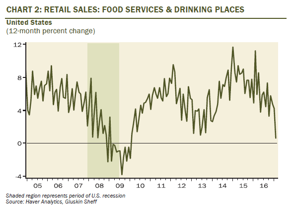
FIGURE 2
 Source: Haver Analytics, Gluskin Sheff
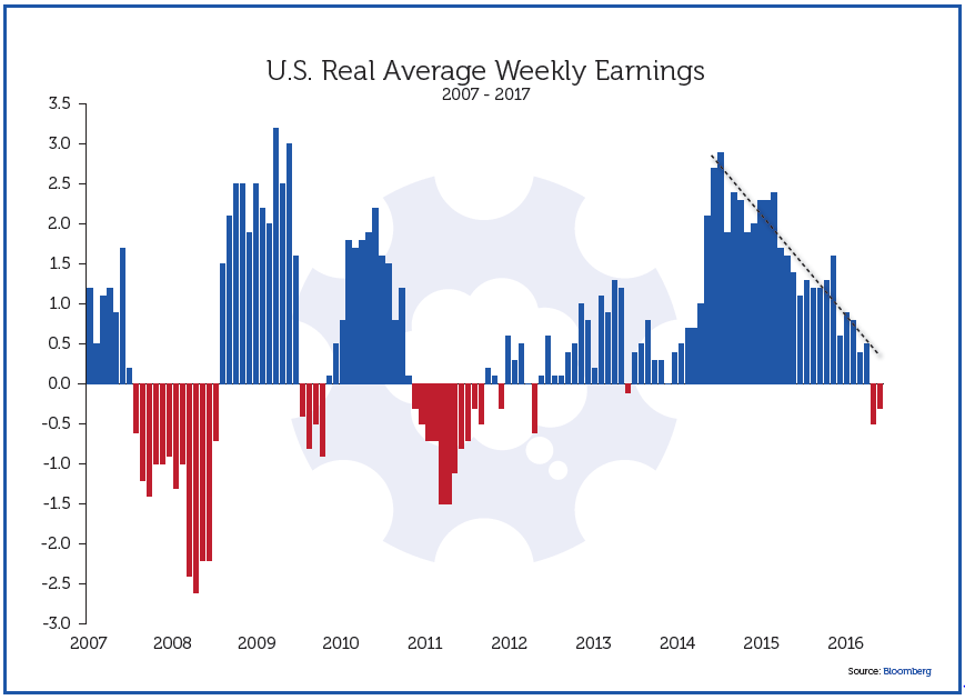
Moreover, as Grant highlights, real household earnings are also heading south. It’s hard for consumers to feel good about busting out the credit cards when their after-inflation income growth is trending toward zero, or even below.
FIGURE 3
 Source: Things That Make You Go Hmmm
FIGURE 4
 Source: Goode Hable Pak at Morgan Stanley
Yet, as mentioned above, he does feel that high inflation has been created by the Fed—and its similarly incontinent central bank peers around the world—but that it has been in asset, not consumer, prices. He believes, as do I (and I know both Grant Williams and Michael Lewitt would concur), that nearly a decade of recklessly easy monetary policies has inflated stocks, bonds, real estate, collectibles, et al, to bubble levels. If you doubt that, despite being an EVA reader, please reflect on the charts below.
FIGURE 5 – INCREASES IN MARGIN DEBT, THE STOCK MARKET, AND GDP SINCE 2002
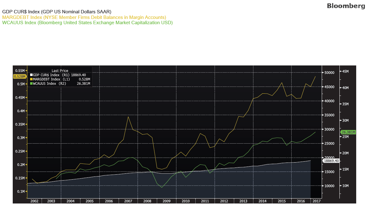
FIGURE 6 – TRIPLE TOP IN HOUSEHOLD NET WORTH RELATIVE TO INCOME?
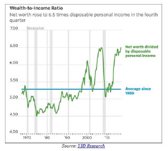
Source: Bloomberg, 13D Research
What is particularly ironic about this is, as Anantha observes, central bankers have gladly taken the credit for bringing down consumer inflation while washing their hands of the asset inflation their policies have created. Call me hopelessly retro, but I’ve never thought hubris and hypocrisy were the hallmarks of the world’s preeminent central bank.
FAKE VIEWS (PART II) By Grant Williams (Reader’s Note: Grant’s article was too long to present in full-form. As such, we have compiled excerpts from Fake Views (Part II) below. Breaks in writing are noted with ellipses throughout this section.) The twin constructs of fake views which began in Part I of this letter, and this week’s continuation around things not being how they seem, are important to understand so let’s begin Part II with an extract from a speech delivered by Janet Yellen at the Stanford Institute for Economic Policy Research in late-January:
(Janet Yellen): “…inflation is likely to move up to 2% over the next couple of years, aided by a strong labor market. In light of the progress that has been achieved towards our employment and inflation objectives and the committee’s assessment of the outlook, the FOMC raised the target rate for the federal funds rate at its December meeting by twenty-five basis points to between fifty and seventy-five basis points. The committee judges however that the stance of monetary policy remains moderately accommodative and so policy should support some further strengthening in labor market conditions and the return of inflation towards our 2% goal. With the unemployment rate near its longer-term normal level and likely to move a bit lower this year, the natural question is whether monetary policy has fallen behind the curve. The short answer, I believe, is no.”And so, in the wake of her illustrious immediate predecessors, Drs. Greenspan and Bernanke, Janet Yellen once again confirms that, no matter what the evidence to the contrary may be, the delusion which unfortunately must sit at the heart of the world’s most important central bank is firmly entrenched. The simple truth is that the Fed has never been so far behind the curve.
…..
Inflation is, of course, ground zero for disingenuity and downright fake views on the part of central banks and governments from Washington to Warsaw and from London to Lisbon and nobody does a better job of tracking and explaining the vagaries of official inflation calculations than John Williams of ShadowStats and I will be leaning heavily on John to help me out here.(Incidentally, John’s ShadowStats service is an incredibly useful one and you can find out more about it by clicking HERE)
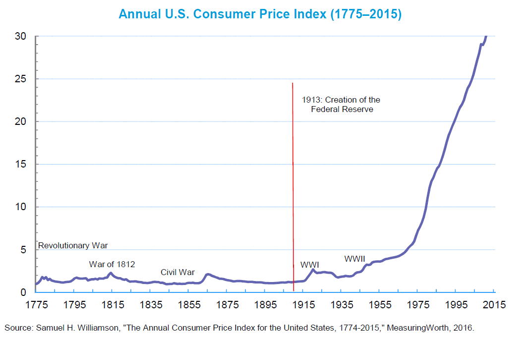
Quite apart from the pressure rising prices places on the average household, so many transfer payments are linked to inflation that it is, of course, in every government’s best interests to measure inflation at its lowest possible level. Here’s the official description of CPI from the BLS website:The Consumer Price Indexes (CPI) program produces monthly data on changes in the prices paid by urban consumers for a representative basket of goods and services.That representative basket of goods and services used to be fixed to ensure a consistent evaluation of how easy (or otherwise) it was for the average consumer to maintain a fixed standard of living. Each month it contained the same components at the same fixed weighting so it was easy to calculate the increased income a consumer might have to earn over a given period in order to maintain their standard of living and that same method for calculation was used (according to the BLS themselves) all the way back to the 1700s and, indeed, prior to the end of WWII, the Consumer Price Index was actually called the Cost of Living Index. Here’s how the annual rate of change in inflation looks going back to 1800 (as estimated by the Minneapolis Fed using a variety of sources).
FIGURE 7
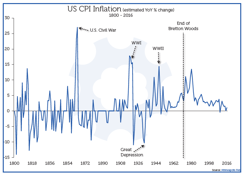 Source: Things That Make You Go Hmmm
…..
ShadowStats publishes its own inflation numbers which maintain a constant measurement of the CPI inflation data based on the 1980 methodology and here is what the two different forms of measurement look like when placed alongside each other:FIGURE 8
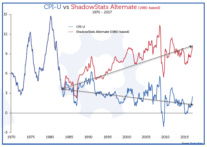 Source: Things That Make You Go Hmmm
It will come as no surprise to anybody that the new version of the calculation produces consistently lower results while the original method heads relentlessly in the opposite direction. John Williams calculates that the changes currently understate CPI inflation by 5.1%.
…..
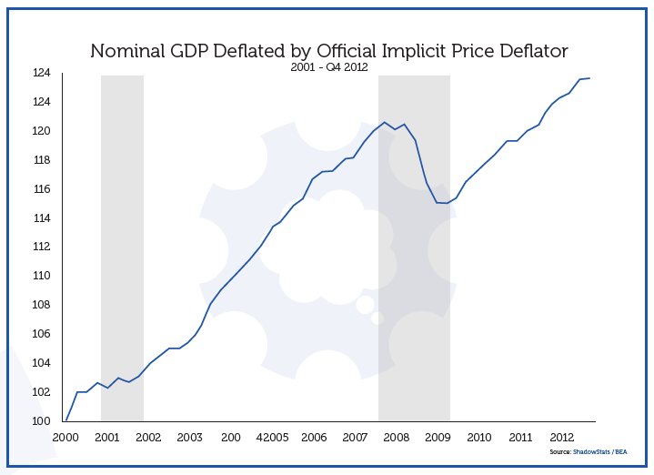
The idea that… things are not as they seem, is not just readily apparent in the inflation numbers, but it fits perfectly with the fake views narrative and bleeds into everything — even the GDP data. Here’s a chart showing headline real GDP in the U.S. going back to 2000.FIGURE 9
 Source: Things That Make You Go Hmmm
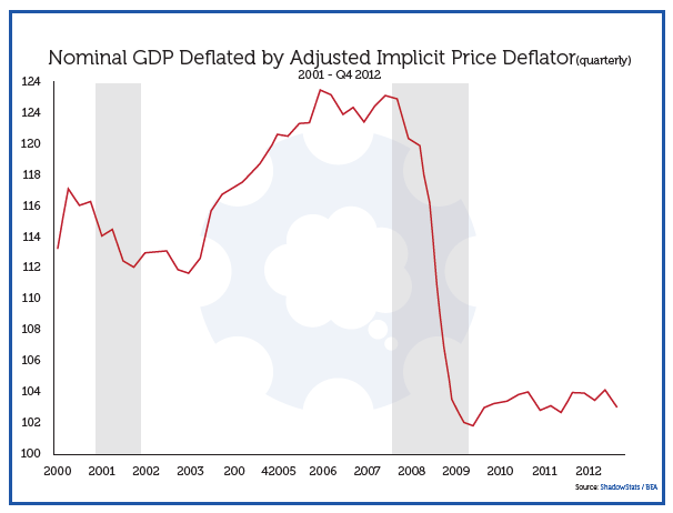
(ShadowStats): No other major economic series has shown a parallel pattern of full economic recovery and beyond. Either the GDP reporting is wrong, or all other major economic series are wrong. While the GDP is heavily modeled, imputed, theorized and gimmicked, it also encompasses reporting from those various major economic series and private surveys, which attempt to mirror real-world activity. In a related area, the 2001 recession has disappeared from GDP reporting, contrary to other major economic series. Flaws in the GDP inflation methodologies have created the “recovery” and erased the previous recession. The graph below plots the GDP corrected for the inflation understatement inherent the GDP deflator of roughly two-percentage points of annual inflation. That inflation understatement resulted from hedonic-quality adjustments, again, as discussed in Hyperinflation 2012.
FIGURE 10
 Source: Things That Make You Go Hmmm
Note that the 2001 recession is back, and that the “2007” recession really started in 2006, consistent with the downturn in the housing market. The economy plunged through 2008 into 2009. Instead of rebounding to full recovery, as seen in the headline GDP, however, the corrected real GDP has been bottom-bouncing, stagnant at a low level of activity. It now is turning down again. The corrected version appears to be much closer to the reality of common experience.And, as you can see over time, the manipulation of inflation numbers has a profound optical effect on the strength of the U.S. economy.
FIGURE 11
 Source: Things That Make You Go Hmmm
…….
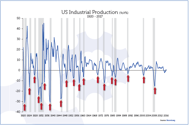
The Fed have missed growth estimates every year since 2010 — and by an almost unfathomably wide margin each time. Similarly, their forecasts for the fed funds rate have been so far off beam as to raise doubts as to why any serious investor would take what they say at face value. That lack of any real credibility hasn’t hurt them thus far because it has resulted in ascending asset prices so investors can sit back, listen to the fake views, chuckle and carry on buying the dips safe in the knowledge that the Fed doesn’t have the balls to raise rates meaningfully and, should anything untoward happen like… oh, I don’t know… maybe a 1% correction — the Fed will step in with more accommodation. You see, that’s the trouble with fake views; you start off uttering them to drive a chosen narrative but you end up being forced to maintain and defend them with both your reputation and your credibility on the line should you fail. Mere mortals such as you and I don’t have the luxury of being able to defend any fake views of our own with the full faith and credit of the United States government or, God forbid, the blank check that an electronic printing press offers, but these people do and they are shameless. Ultimately, however…things will be shown to be decidedly not what they seem. On March 17th, alongside the claims of an economy which is robust enough to stand another round of tightening, the latest U.S. Industrial Production print was announced and, as we have shown in this publication previously, this is just about as concrete a barometer for an upcoming recession as any investor could wish for.FIGURE 12
 Source: Things That Make You Go Hmmm
PRESIDENT TRUMP NEEDS TO DRAIN THE MONETARY POLICY SWAMP By Anantha Nageswaran Just before the first quarter ended, the United States released the March data for its most comprehensive (excluding the GDP deflator, of course) inflation indicator—the Personal Consumption Expenditure: Chain Price Index. The annual percentage change (PCE inflation rate) in the headline index had crossed 2.0%. It read 2.1% when rounded off. Between January and September 2015, it hovered at around 0.2%. The last time it was above 2.0% was in April 2012. The core index reflected an annual percentage change of 1.8%. Is inflation about to raise its head in the United States in a big way? It is well known that the Federal Funds rate hovered at around 0.0% to 0.25% since December 2008 until the Federal Reserve made a first rate hike after seven years in December 2015. The next one followed a year later in December 2016 and the third rate hike in March. The Federal Funds rate is still below 1.0%. Is the Federal Reserve behind the curve? The two questions posed above are possible to answer independently, even though many think that they are interconnected. In other words, some think that because the Federal Reserve has done too little too late, a nasty resurgence of inflation in the United States is inevitable. But that is not altogether true. One can agree on the Federal Reserve without agreeing with the prediction on inflation, which is the stance I take in this brief note. The reason why the Federal Reserve ends up creating bubbles and busts is that it is too slow to begin tightening. When it does, it overreacts because it is already late in doing so for the cycle and the strains and faultlines of the preceding boom had begun to manifest in any case, especially in asset markets and in risk-taking. That was the case in 1987, in 1999-2000 and in 2004-07. The only exception was in 1994 when it moved to raise rates aggressively before asset prices had entered bubble territory. That is why the United States economy narrowly avoided a recession and there was no bubble to prick, then. But, that was the exception and not the rule. Those were the days when Dr. Greenspan actually worried about irrational exuberance in the stock markets. But, this time around, the Federal Reserve has stuck to the script of the last three decades. It has begun normalising (note, it is not the same as ‘tightening’) monetary policy very slowly. Indeed, it has moved from being ‘recklessly ultra-loose’ to being ‘somewhat recklessly loose’ in the last two years. Doug Noland put it very well in his weekly credit bulletin on March 4:
“The current remarkable cycle has brought new meaning to the phrase ‘Behind the Curve.’ Rates were cut from 5.25% starting back in September 2007. By December 2008, they had been slashed to zero (to 25bps), with the DJIA ending the year at 8,876. Now, with the DJIA at 21,000, Fed funds sit at only 0.75%. Rates have budged little off zero despite record securities prices, record corporate bond issuance, record home prices and a 4.8% unemployment rate. While Q4 data will be out soon, it appears that 2016 posted the largest Credit growth since 2007. Through the first three quarters of 2016, non-financial Credit expanded at an annualized pace of just under $2.4trn, not far off 2007’s record $2.503trn. For comparison, non-financial debt expanded $1.259trn in ‘09, $1.589trn in ‘10, $1.309trn in ‘11, $1.916trn in ‘12, $1.545trn in ‘13, $1.807trn in ’14 and $1.931trn in ‘15. U.S. Credit growth and economic activity had attained sufficient self-sustaining momentum by 2014 and 2015 for the Fed to have launched so-called ‘normalization.’ It was a major policy blunder not to have this process well underway by 2016. The Fed basically disregarded domestic considerations as it postponed rate adjustments after its single December 2015 baby-step.”That said, the Federal Reserve is right to make an attempt to catch up with the economic cycle now. It is better late than never. The consequences of remaining recklessly ultra-loose would be worse. Yes, the cycle is about eight years old, but, look at the cyclical indicators: a. Personal Consumption Expenditure (PCE) growth is accelerating b. Change in the Labour Conditions Index is now positive. It showed weakness in the early part of 2016. That phase has passed. c. The Manufacturers’ New Orders (Non-Defence capital goods excl. aircraft) is now showing positive change in the last three months (y/y) after a long spell in the negative territory. d. Chicago Fed National Activity Index is accelerating now
FIGURE 13
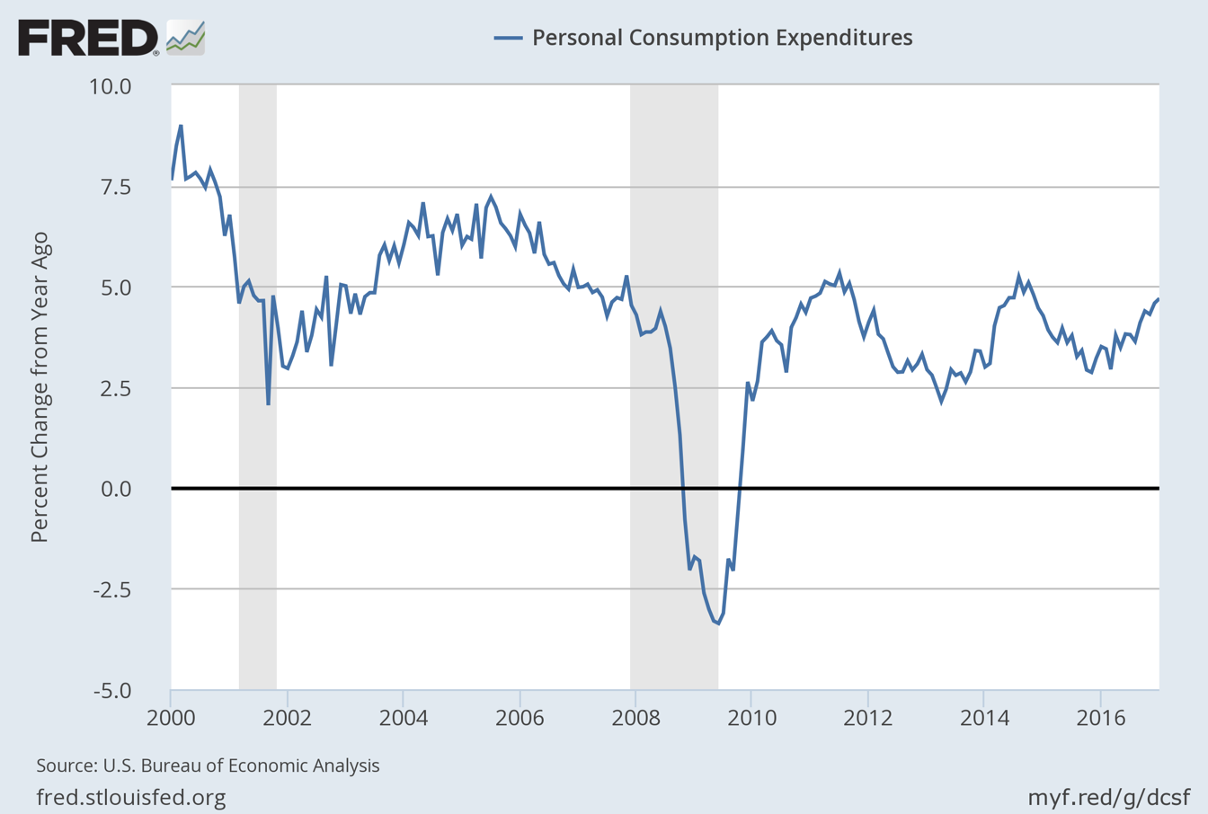
FIGURE 14
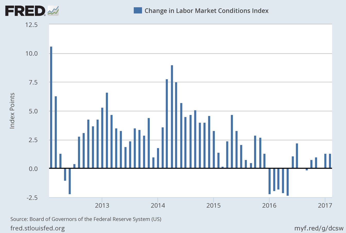
FIGURE 15
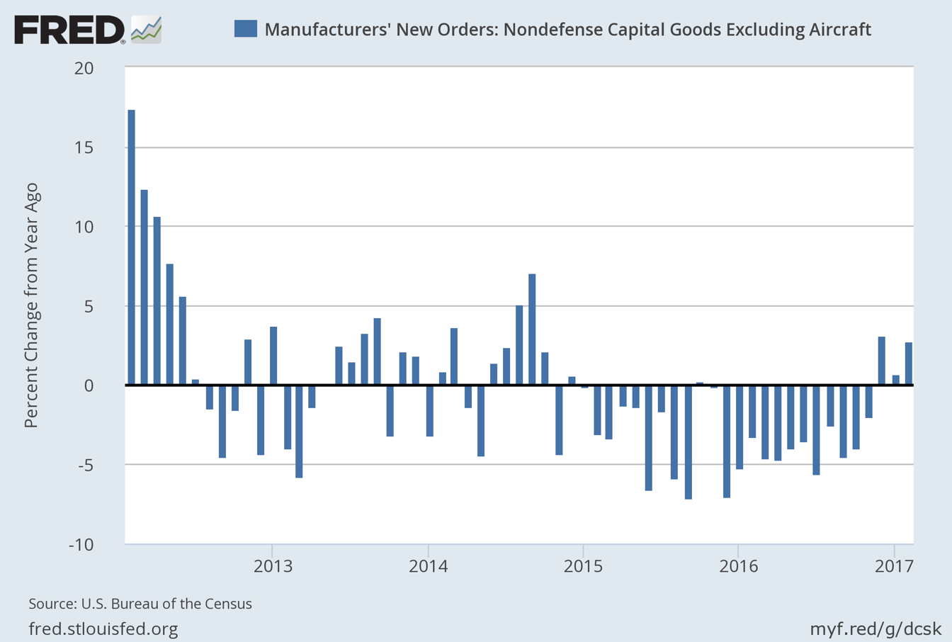
FIGURE 16
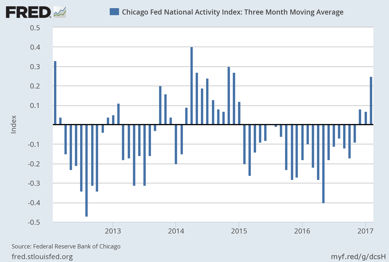 Source: Federal Reserve Bank of St. Louis
FIGURE 17 – AMERICA: PCE INFLATION AND CHANGES IN THE AVERAGE HOURLY EARNINGS (Y/Y % CHANGE)
 Source: Federal Reserve Bank of St. Louis
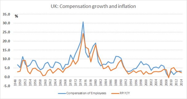
FIGURE 18 – THE UNITED KINGDOM: RETAIL PRICE INDEX (Y/Y % CHANGE) AND EMPLOYEE COMPENSATION (Y/Y % CHANGE)
 Source: Federal Reserve Bank of St. Louis
OUR CURRENT LIKES AND DISLIKES
No changes this week.
LIKE
- Large-cap growth (during a correction)
- International developed markets (during a correction)
- Canadian REITs
- Cash
- Publicly-traded pipeline partnerships (MLPs) yielding 7%-12%
- Intermediate-term investment-grade corporate bonds, yielding approximately 4%
- Gold-mining stocks
- Gold
- Intermediate municipal bonds with strong credit ratings
- Select blue chip oil stocks (on a pull back)
- Emerging bond markets (dollar-based or hedged); local currency in a few select cases
- Investment-grade floating rate corporate bonds
- Mexican stocks
- Solar Yield Cos on a pull-back (and profit-taking for tax deferred accounts, in some cases)
- Long-term municipal bonds
- Long-term Treasury bonds
- Long-term investment grade corporate bonds
NEUTRAL
- Most cyclical resource-based stocks
- Short-term investment grade corporate bonds
- High-quality preferred stocks yielding 6%
- Short yen ETF (closing out positions and removing)
- Emerging market bonds (local currency)
- Short euro ETF (sell a portion for solid gain)
- Bonds denominated in renminbi trading in Hong Kong (dim sum bonds)
- Canadian dollar-denominated bonds
- Mid-cap growth
- Emerging stock markets, however a number of Asian developing markets, ex-India, appear undervalued (taking profits on India)
- Floating-rate bank debt (junk)
- Select European banks
- BB-rated corporate bonds (i.e., high-quality, high yield)
DISLIKE
- US-based Real Estate Investment Trusts (REITs) (once again, some small-and mid-cap issues appear attractive)
- Small-cap value
- Mid-cap value
- Small-cap growth
- Lower-rated junk bonds
- Large-cap value
DISCLOSURE: This material has been prepared or is distributed solely for informational purposes only and is not a solicitation or an offer to buy any security or instrument or to participate in any trading strategy. Any opinions, recommendations, and assumptions included in this presentation are based upon current market conditions, reflect our judgment as of the date of this presentation, and are subject to change. Past performance is no guarantee of future results. All investments involve risk including the loss of principal. All material presented is compiled from sources believed to be reliable, but accuracy cannot be guaranteed and Evergreen makes no representation as to its accuracy or completeness.